OTHER CONSIDERATIONS
In addition to Bleeds, Safety, and Trim and Borders, there are other artwork considerations to keep in mind for the best printing results.
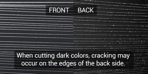
When your artwork has heavy saturation or dark colors on the edges, especially if the artwork is double-sided, you may see cracking along the edges of the finished items.
We typically cut blade-side towards the darker side of the printed material, but if both sides are dark and have heavy saturation, then this cracking may occur on the back side of non-laminated stocks.
To prevent this, you can switch the backside to lighter colors. If you must use dark colors, use as little ink as possible or choose a laminated stock.

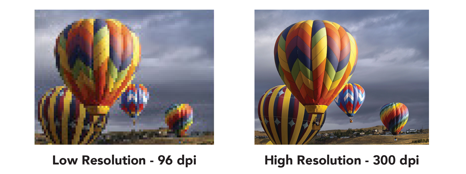
When possible, please provide vector artwork or high resolution images (300 dpi or greater at the finished size). Low resolution artwork created for the web or scaled up from a smaller size will often print blurry or pixelated.
On some jobs, we use a printing process called gang run printing to be able to offer cost-effective options by printing multiple jobs together before cutting sheets apart. Using this process, however, exact color reproduction isn’t always possible due to a conjoining job’s color needs and there can be up to a 10% variance.
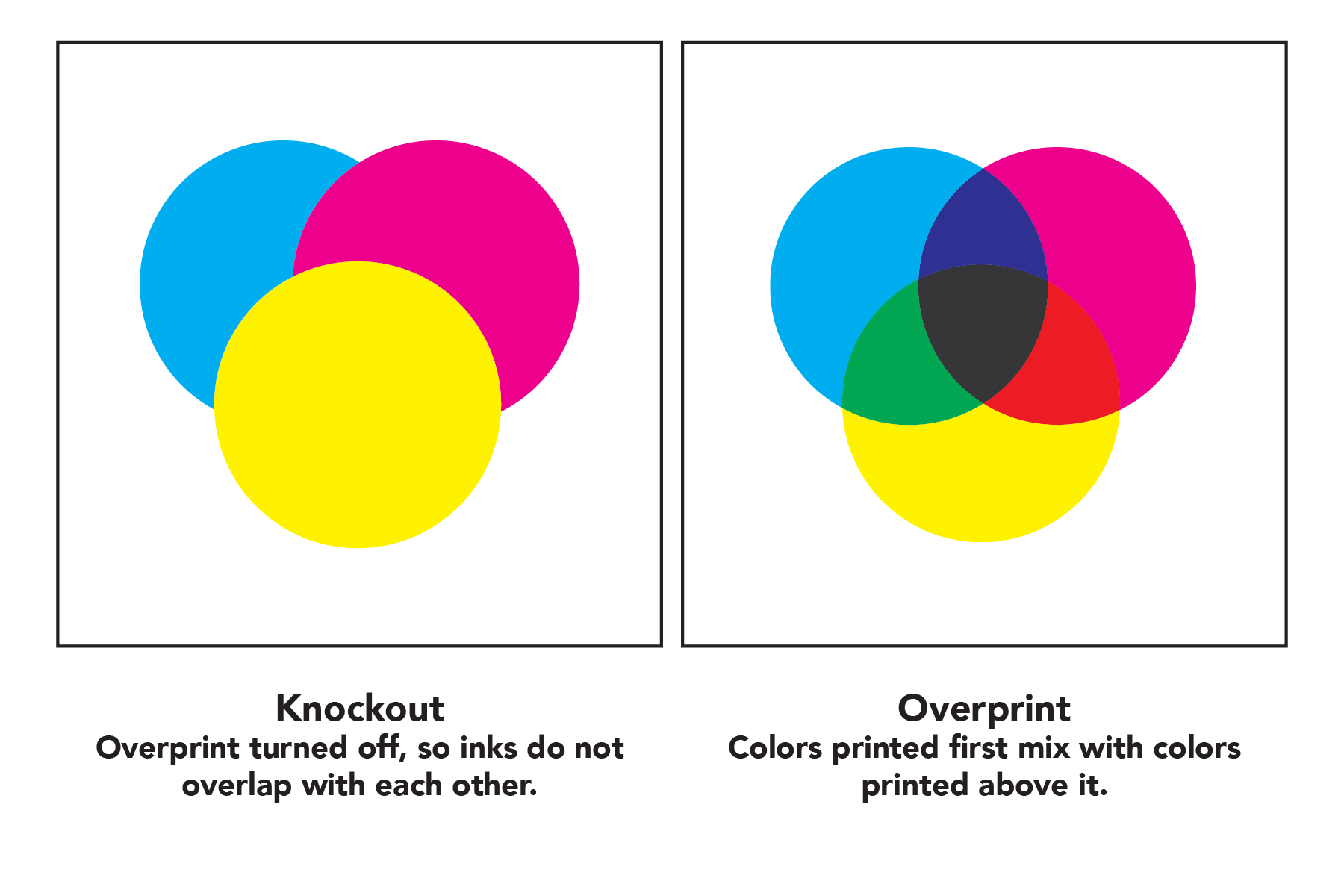
Overprint is used to intentionally overlap inks for a number of reasons. However, if you have unintentionally set objects in your artwork to overprint, it can cause unexpected results in the final print. We suggest that you turn all overprint objects off before submitting your files.
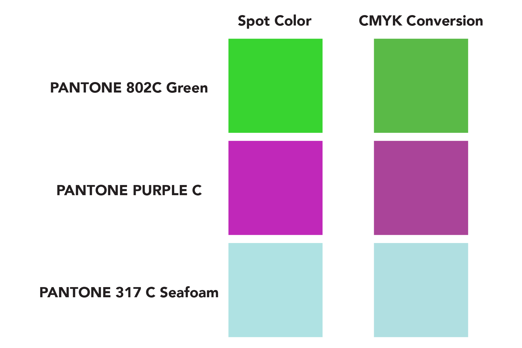
If you need to us match colors, provide us with Spot Colors or Pantone Colors or let us know if you are including them in your artwork. You may want to request a G7 Color Calibrated hardcopy proof for large jobs where color matching is important, however, there will be an additional charge for the proof.
We can color match your existing Spot and Pantone colors, or you can convert Spot and Pantone to CYMK yourself. There can be some variation on printed materials when matching colors.
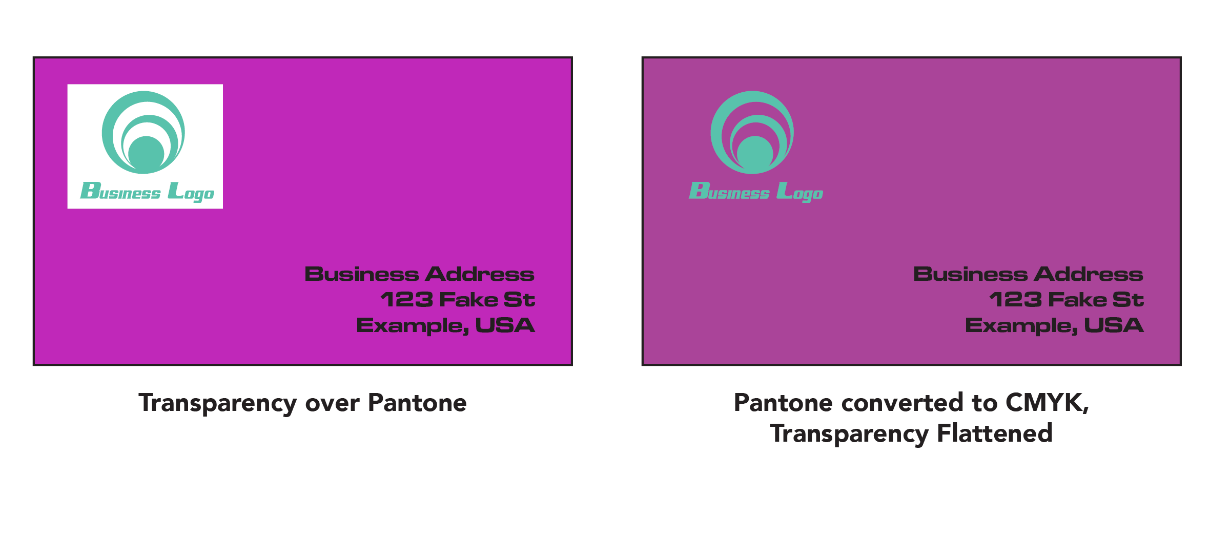
Spot colors do not blend with transparent elements that are on top of them. This can result in parts of your image that you expect to be transparent having a white background. To prevent this, never use shadows, glows, or any other transparency (image or otherwise) on top of a spot color. Always convert your spot color to CMYK and flatten before sending.
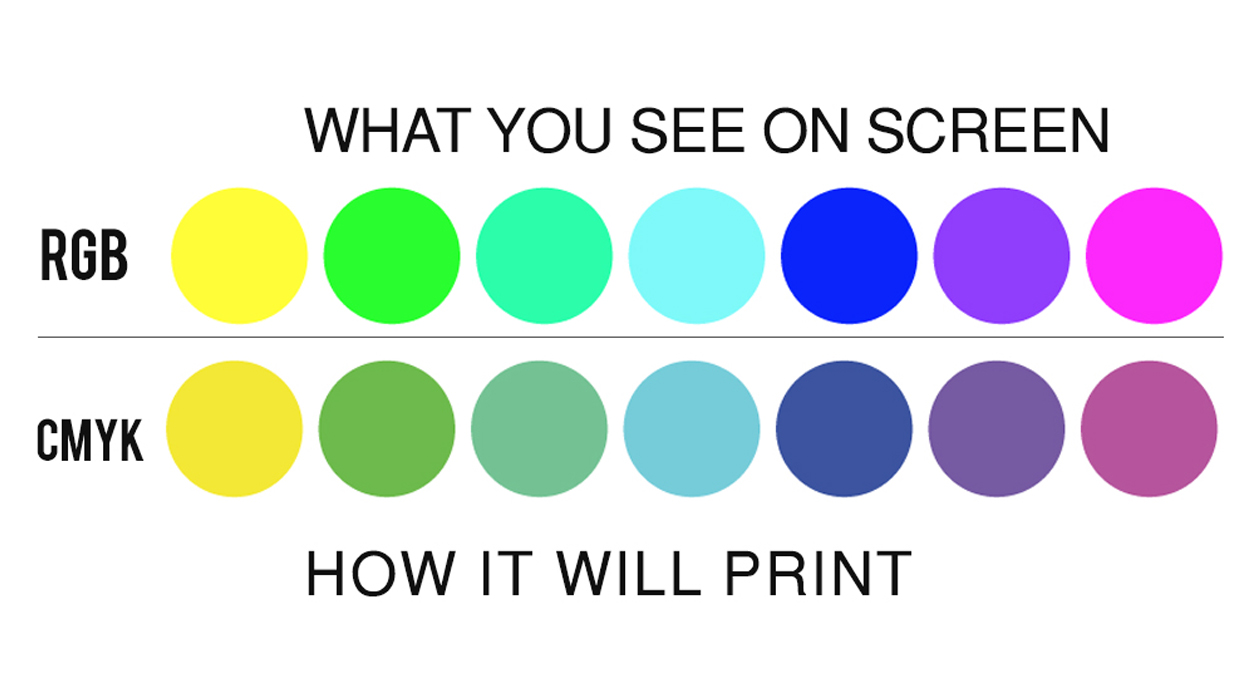
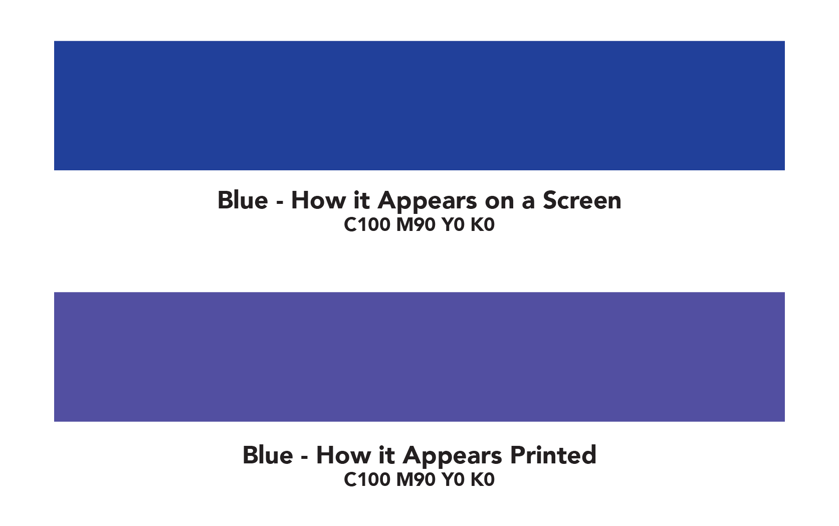
All RGB colors must be converted to CMYK in order to print. Please note that RGB Colors may show brighter on screen than converted CMYK colors will print. See Graphic Below.
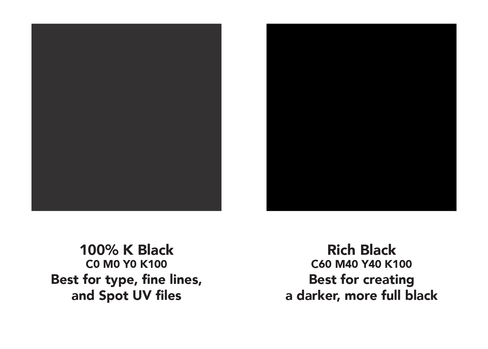
Rich Black is an ink mixture of solid black, 100% K, with additional CMY ink values. This results in a darker tone than black ink alone. If you print black alone as 100% K, the resulting black may not be as dark as you might like.
Black Text should always be 100% K, but if you have larger areas of black in your art that need to be a dark rich black, use additional CMY ink values, such as C 60 M 40 Y 40 K 100.
Spot UV and other spot files to indicate areas that are UV, raised, embossed, cut out, etc. should always be 100% K and not Rich Black.
Registration Black, included in some graphic design software, should never be used in your print-ready artwork. It is designed for non-printing registration marks and will not be printed, depending on the printer used.
Blue is close to purple in the CMYK spectrum. Use a low amount of magenta whenever using high amounts of cyan to keep blue colors in your final art from appearing purple.
When using a blue in your design, always make sure to leave at least a 30% difference in your Cyan and Magenta values for best results.
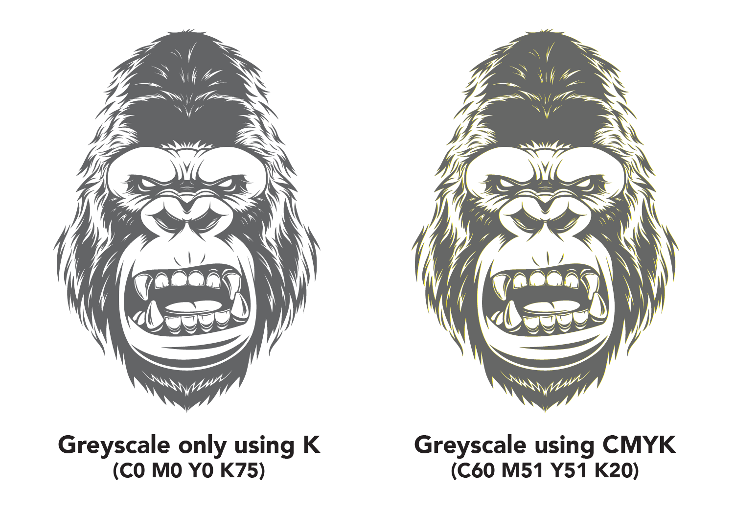
Grayscale images that are converted to CMYK will have a color shift in the final print. That shift may be green or yellow. Always check the CMYK values of your grayscale in the final CMYK document. If there are other values other than K in your grayscale image, there is a chance that the color will vary.
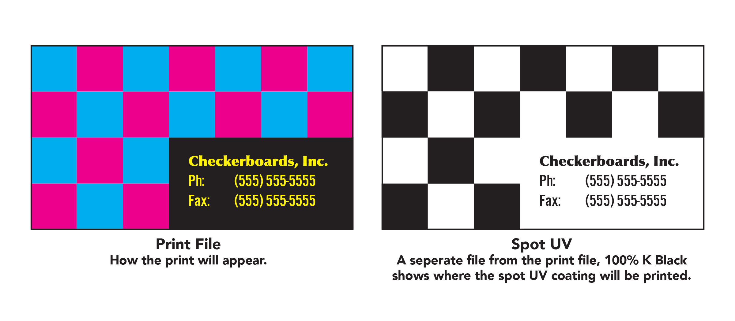
When creating a Spot UV project, you must include a Spot UV file along with the regular print file. The Spot UV file is used to show where the UV coating needs to be applied.
Please only use solid 100% K to indicate where you would like the UV. Do not use shadows, glows, gradients, or grayscale images. White will indicate no UV. Vector based masks are recommended.